
How to Edit Like Iman Gadzhi in 2026 (The Motion Graphics, Not Just the Music)
Few editing styles have been copied as much as Iman Gadzhi's. There are template packs, preset bundles, "masterclasses" and hundreds of recreation tutorials.
Most of them miss the point. The look doesn't come from a pack of overlays. It comes from a handful of design rules applied with a lot of discipline. Learn the rules and you can get the effect with any tool — including ones that don't require After Effects.
What the style actually is
Strip it down and the Iman Gadzhi style is:
- A talking head as the anchor. He's on screen most of the time. The graphics support him; they don't replace him.
- Custom motion graphics for key moments — not stickers and emojis, but designed elements that illustrate exactly what he's saying.
- Subtle grid backgrounds behind graphic scenes, which make everything feel structured and "designed".
- UI-style cards and screens — clean rounded rectangles, dashboards, notifications, charts — that feel like a premium app.
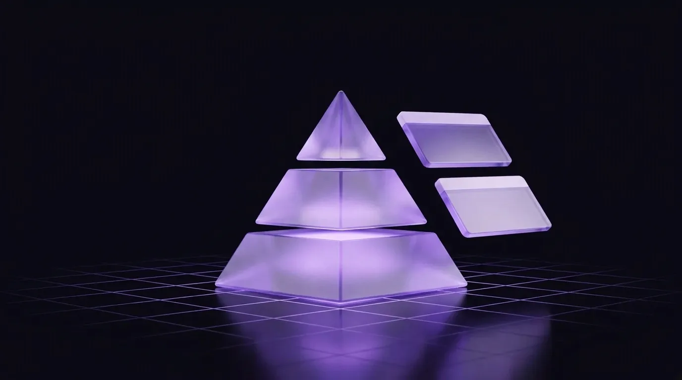
- Numbers and diagrams that build as he talks: counters, stacked layers, simple 3D shapes like a tiered pyramid with a label on each level.
- A restrained palette, often pulled from the footage itself, with one accent colour doing the emphasis.
- Smooth, consistent motion. The same easing and the same kinds of entrances everywhere.
- Cinematic music underneath.
Editors who break it down tend to group the work into three principles: planning (deciding where animations go), design (consistent colours and scene types) and animation rules (a fixed vocabulary of text, icon, UI and camera moves).
Rule 1: Plan the moments before you animate anything
The biggest difference between this style and a cluttered edit is that graphics appear only where they earn it. Go through the script and mark:
- Numbers — prices, revenue, percentages, time.
- Frameworks — "there are three levels", "two paths", "a simple formula".
- Things — an app, a message, a website, a result.
Everything else stays as a clean talking head. The restraint is what makes the graphic moments feel big.
Rule 2: Pick a design system and never leave it
Choose one font family, one background treatment, one card style and one accent colour. Every graphic in the video uses them.
Consistency is doing most of the "premium" work here. A simple graphic in a consistent system looks more expensive than an elaborate one in a new style every time.
Rule 3: Make information build, not appear
Notice how things arrive in this style: a number counts up rather than popping in. A pyramid assembles level by level. A card slides in, then its contents fill. Information that builds matches the pace of speech, and gives the viewer a reason to keep watching until it's finished.
Rule 4: Use the same motion vocabulary everywhere
Pick a handful of moves — a soft slide-and-fade for cards, a count-up for numbers, a gentle scale for emphasis — and reuse them. Resist adding a new transition just because it exists.
Rule 5: Keep the speaker clear
Graphics sit beside or around the speaker, or take over the frame briefly on a grid background and then hand back. They don't sit on his face while he's making a point.
How editors usually build it
The traditional route is After Effects for the graphics and Premiere Pro or DaVinci Resolve for the edit, often with a template pack as a starting point. It works, and it's how most of the recreation tutorials do it. It's also slow: each custom graphic is designed, keyframed, exported and lined up with the voice by hand, and a template pack gives you his graphics rather than ones built for your script.
How to get the look on your own videos without After Effects
The rules above are exactly what you'd tell a good editor. With Rescroll AI Motion Graphics, you tell them to the AI instead:
- Drop your talking-head video (vertical for Shorts, Reels and TikTok, or horizontal for YouTube).
- Mark your moments — the numbers, frameworks and things from Rule 1.
- Describe each one in the style: "On a dark grid background, build a three-tier pyramid level by level as I name each level — Skill, Offer, Audience — in white with one purple accent."
- Attach references to lock the design system from Rule 2: a screenshot of a frame whose look you like, your font files, your logo. Rescroll matches their real colours, type and spacing.
- Read the plan, build, adjust. Rescroll lays out its plan first, places each graphic around you, times it to your words and checks its own frames. "Slower build, smaller cards" is a sentence in the chat.
Because every moment is described against the same references, the look carries from one graphic to the next, and from one video to the next.
A year of revenue as a clean bar chart: flat months, then the spike on "and then this", with the axis rescaling to fit — the kind of build-as-you-speak moment the style is known for.
One honest note: Rescroll works in any aspect ratio, so it covers both the Shorts version of the style and the 16:9 YouTube one, but it doesn't add music — you'll add the cinematic track in your editor or the app.
Common mistakes when copying the style
- Using the template pack as-is. Your audience has seen those exact graphics. Use the rules, not the assets.
- Graphics on every line. The style is premium because it's restrained.
- Too many colours. One accent. Everything else neutral.
- Mismatched motion. Five different entrance animations reads as amateur, however good each one is.
- Forgetting the talking head. The style works because a real person is carrying it.
Frequently asked questions
What fonts does Iman Gadzhi use? Recreation guides name various clean geometric sans-serifs. Which exact font matters much less than using one family consistently.
How long does it take to edit a video in this style? By hand in After Effects, a short with several custom graphics can take a skilled editor most of a day. With AI, most of the time goes into deciding the moments and describing them.
Does this style work for every niche? It suits business, finance, education, tech and self-improvement best — anywhere credibility matters. For comedy or lifestyle content it can feel too corporate.
For more on the craft behind it, see how to add motion graphics to a talking-head video and do motion graphics actually increase retention?